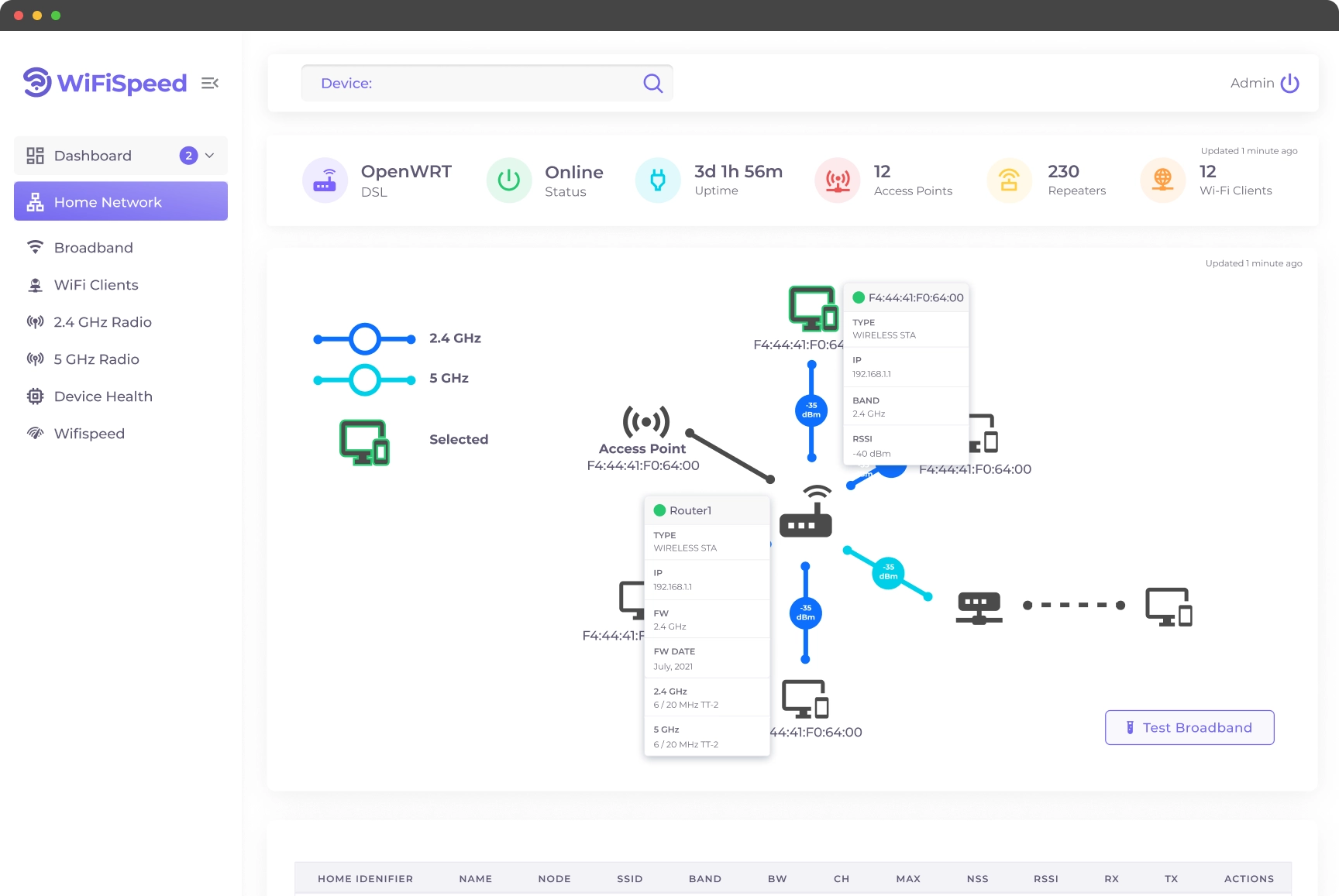
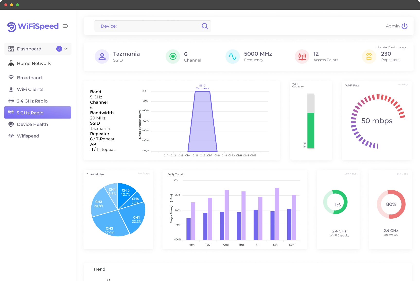
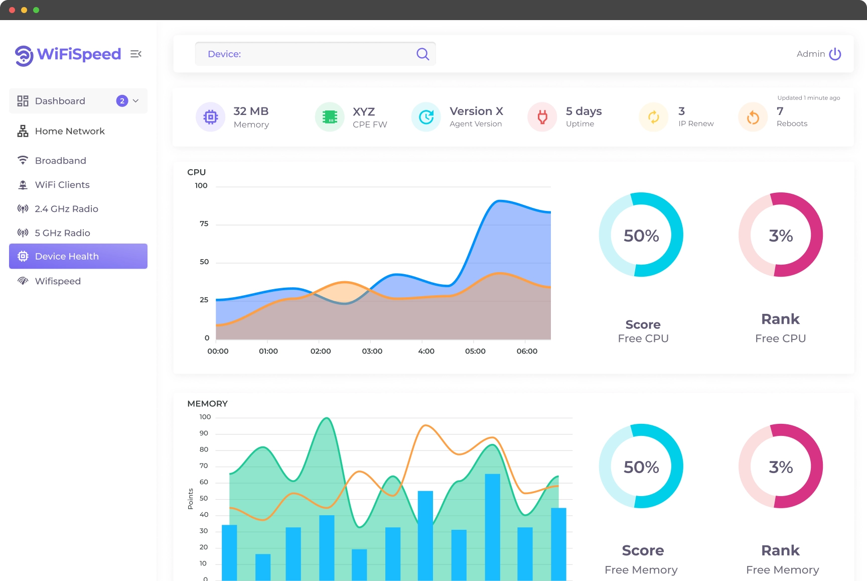
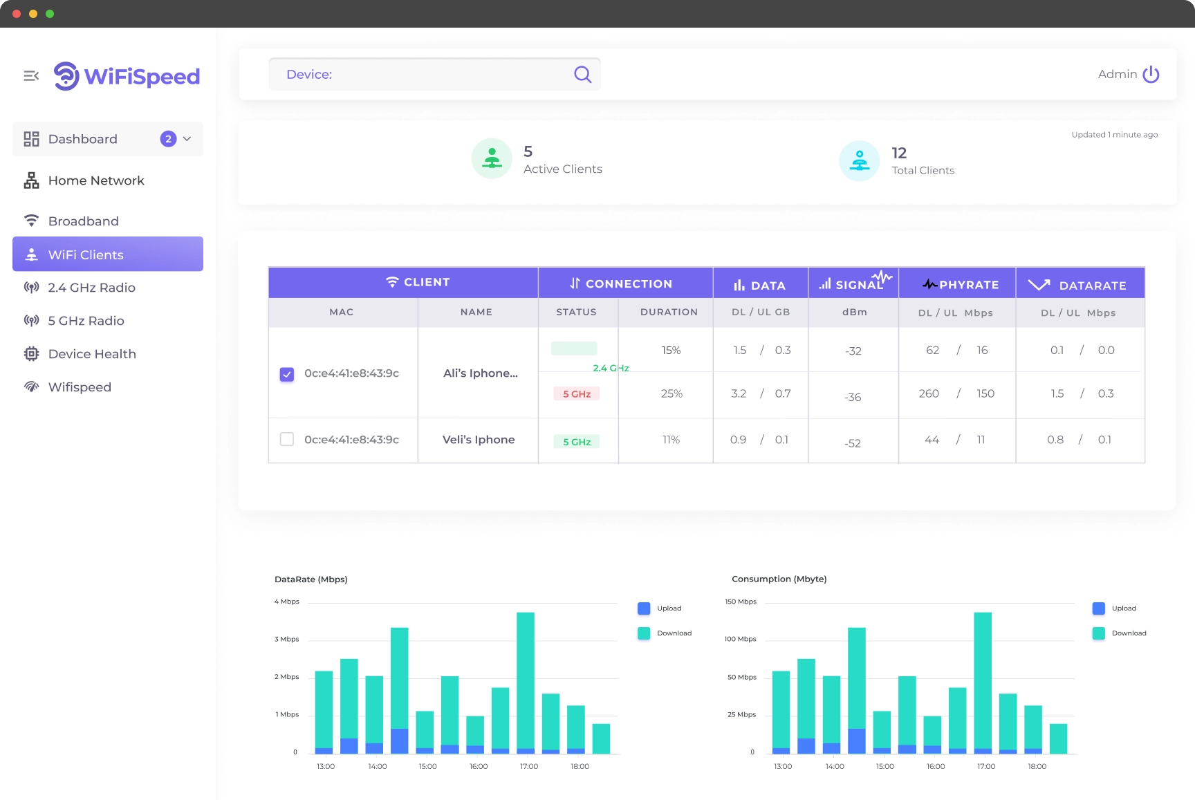
WiFiSpeed Population Dashboard
The Challenge
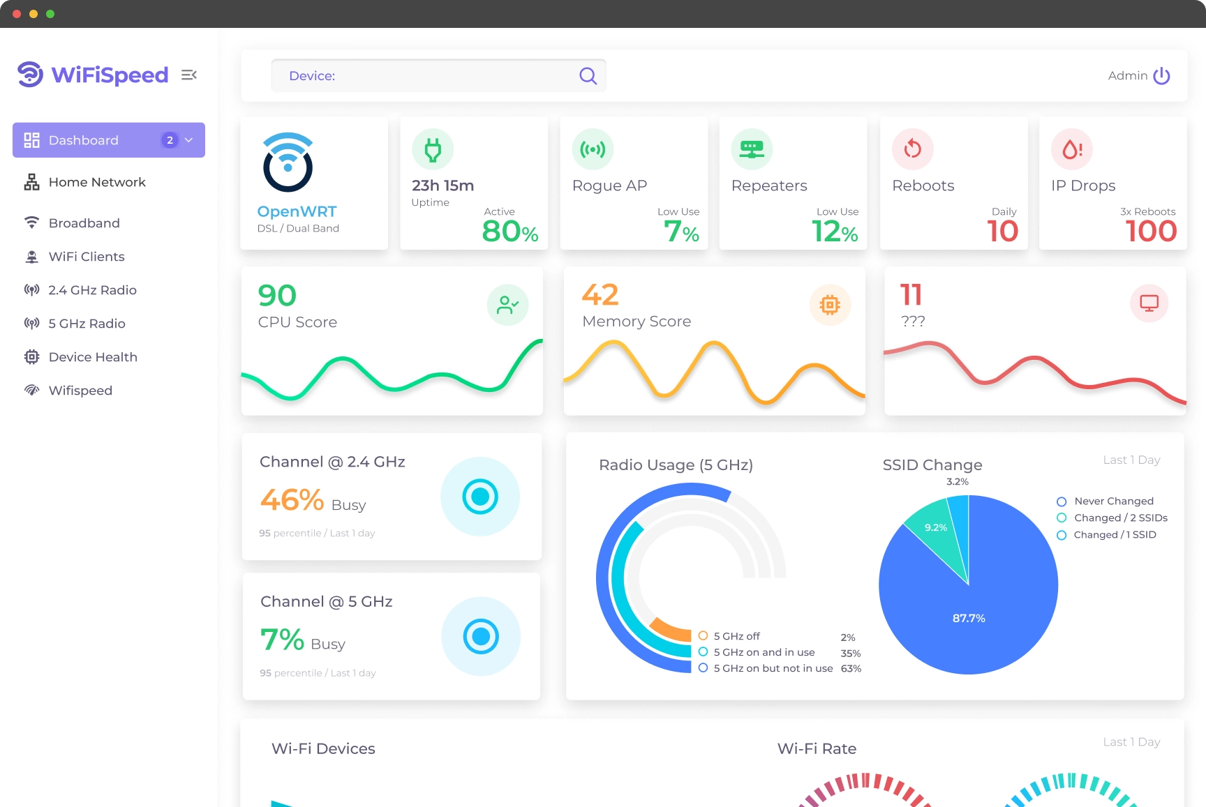
QuantWiFi needed a comprehensive dashboard to visualize complex population and connectivity data. The challenge was to transform dense technical metrics into accessible, actionable insights for diverse stakeholders, ensuring clarity without sacrificing data depth.
The Solution
I designed the complete UX/UI for the dashboard suite, establishing a clean, data-first visual language. By prioritizing hierarchy and interaction, the new interface allows users to seamlessly navigate between macro network trends and granular device health metrics.
Key Screens